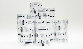
This artist uses a very unique way of designing her business cards, using circular objects. She uses the bottom of a wine glass to create a perfect circle but also gives it a slight smudge effect and also creates a nice hand made quality to the work.
Tuesday, 30 October 2012
Monday, 29 October 2012
Alphabet Design
(Click Images for Enlargement)
I wanted to design my own font for this project as it will allow me to incorporate wave forms into the logo and the type. I did this over the half term and i also played around with a few colours, although not yet finished, i have a definite type font i want to use.
I wanted to design my own font for this project as it will allow me to incorporate wave forms into the logo and the type. I did this over the half term and i also played around with a few colours, although not yet finished, i have a definite type font i want to use.
Thursday, 4 October 2012
Are We Designer - Inspirational Artists - Project From Cologne With Love - -
(Click Images For Enlargement)
I have looked at the work of a graphic designer who uses shapes and symbols as a container for the work he makes. I like the way he does this and this has inspired me to try it out myself.
I have looked at the work of a graphic designer who uses shapes and symbols as a container for the work he makes. I like the way he does this and this has inspired me to try it out myself.
Collaborative Practice #4
I found this weeks brief very enjoyable but did not manage to get a high quality of work completed on time, i have now managed to get the work all processed into my sketch book, but i need to work not only on quality but on quantity.
- Abels work this week has taken many different paths, not one design looks the same as the previous and so this broadens his work and which path he can go down for development.
- abel needs to work on quantity as well as quality although his work is all up to a very good standard.
I will take all the points made through the previous weeks and develop my work both through quality and quantity.
Collaborative Practice #3
This week we decided to experiment with volume and dimension. I tried out different ways of showing the way of the third dimension. Rather than actually making 3D sculptures I decided to play around with creating a space within the second dimension giving the illusion of depth on a flat surface.
- I think that Abels work has developed more so from previous weeks, his work seems to have taken shape although it doesn't really link with the project he is working on.
- Abel has used the same typography from previous weeks, showing that he has some kind of link between the different briefs.
I think i have handled this weeks brief much better than i was expecting, I will try to develop my work and link it together during the next brief.
Subscribe to:
Comments (Atom)


